
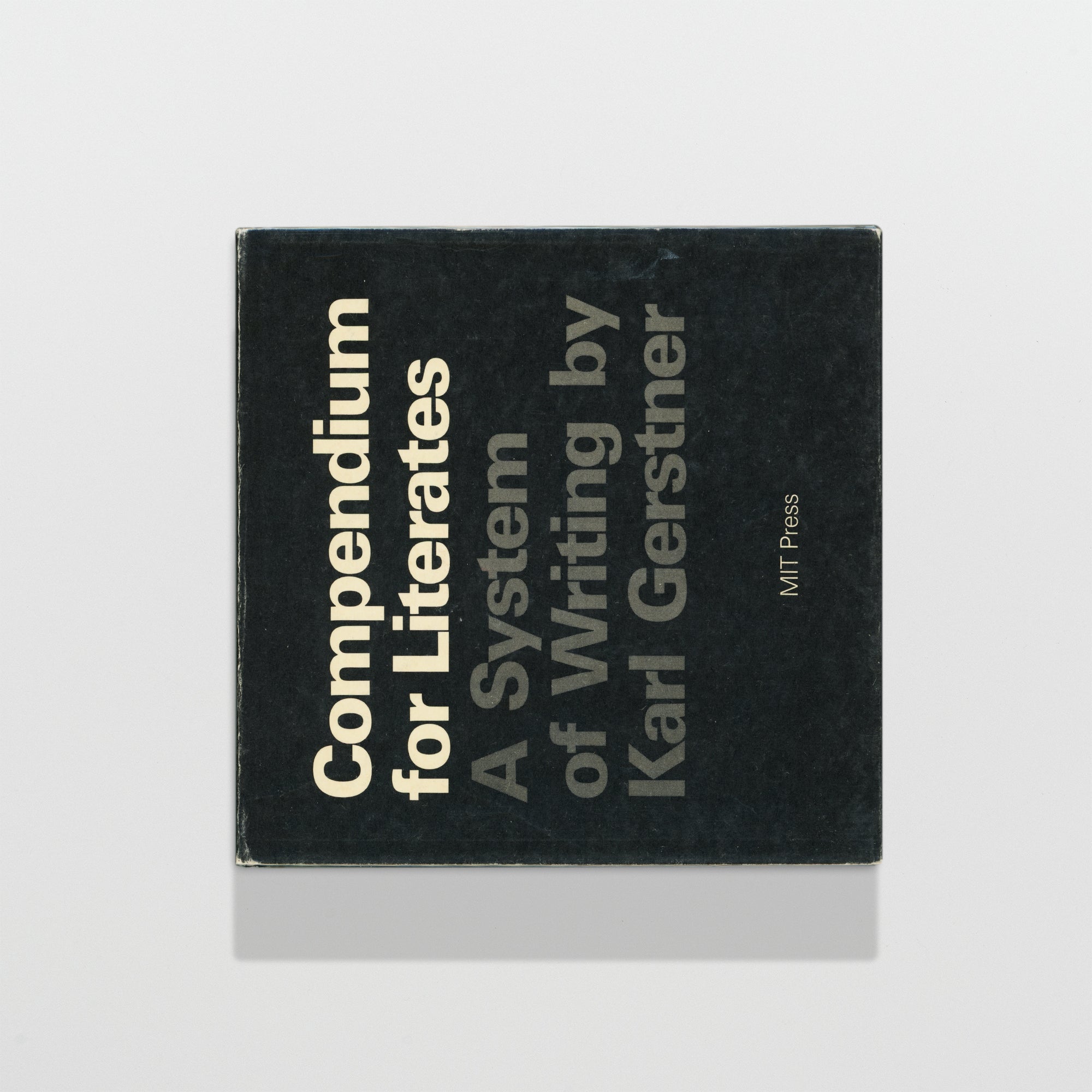
Compendium for Literates: A System of Writing
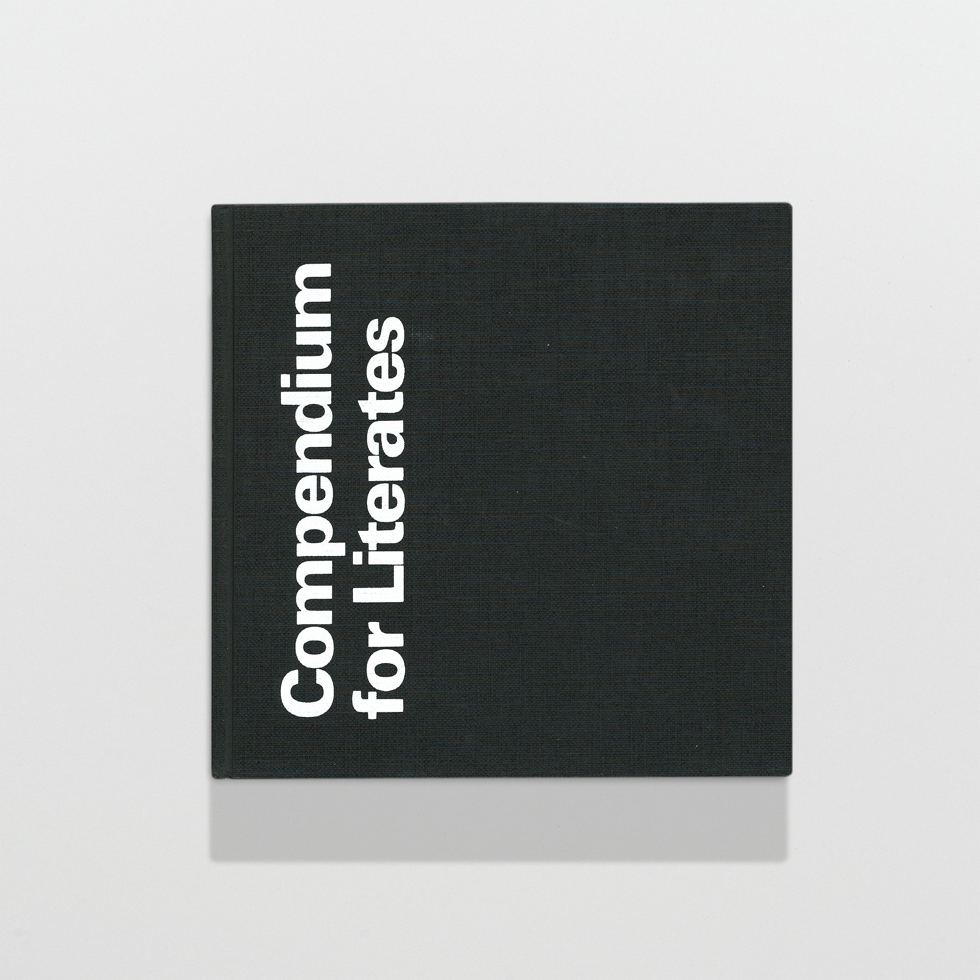
Cambridge: MIT Press, 1974. First U.S. edition. Square 8vo hardcover in dust jacket and black cloth covers with white lettering. Text block is offset printed in black and white and color with French fold binding. Unpaginated.
The first English translation of this seminal philosophy on writing, design, and systems which was originally published 1972 in German. Efficiently organized into five chapters, the typographic layout of the book is set sideways creating a unique experience as it’s read from top to bottom with the gutter dividing the page in half. Gerstner’s fascination and obsession with systems clearly shines through in this thoughtful book exploring theories surrounding the design of language and syntax as a means to create more efficient ways of communication. Some of the parameters presented herein specifically relate to the ‘coming of electronically controlled, or computer controlled typography.’ The overall design is unmistakably Swiss and set in Univers designed by Adrian Frutiger. This is an academic lesson in typography and graphic design still relevant today. Highly recommended for any typographer or designer.
Gerstner is one the great Swiss designers and typographers of the 1960’s along the lines of Josef Müller-Brockmann, Armin Hofmann, Otl Aicher, Max Bill, and Adrian Frutiger. A student of Emil Ruder at Allgemeine Gewerbschule Basel, he’s created countless iconic works of advertisements, posters, and books. Gerstner believed in the philosophy that typography could be a more effective tool if used in a more informed manner creating a connection between the word and the meaning. A philosophy also shared by concrete poets. A firm believer in the grid and systems surrounding design and visual problem solving, Gerstner’s work lives on today as some of the most recognizable Swiss design ever created.
Some light tide markings to the top edge of the text block and some rubbing and wear to the margins of the dust jacket, else fine. Item #22
Out of stock